How to create beautiful Shapes in CSS — A Teardown of 3 Shapes, purely made in CSS#
Over the time I came across some really interesting shapes, purely made in CSS and I always asked myself how a combination of CSS properties can create such complex and elegant shapes.
I have picked 3 shapes that we will be recreating in this article.
Drawing shapes in CSS typically boils down to using a combination of width, height, border, top, right, left, bottom and transform properties with pseudo elements like :before and :after.
Let’s take a look at this coloured box:

.box {width: 200px;height: 200px;border-top: 10px solid lightgreen;border-right: 10px solid mediumpurple;border-bottom: 10px solid lightsalmon;border-left: 10px solid moccasin;}
You can see that the cutting edges of the borders are diagonally to each other. Let’s remove the box’s width and height and increase all border widths:

.box {width: 0;height: 0;border-top: 100px solid lightgreen;border-right: 100px solid mediumpurple;border-bottom: 100px solid lightsalmon;border-left: 100px solid moccasin;}
All of a sudden we got 4 triangles. Awesome!
But what if I only want to have one triangle?
Just set the other border colours transparent:

.box {width: 0;height: 0;border-top: 100px solid transparent;border-right: 100px solid transparent;border-bottom: 100px solid lightsalmon;border-left: 100px solid transparent;}
Or add some transformations...:

.box {width: 0;height: 0;border-top: 100px solid transparent;border-right: 100px solid transparent;border-bottom: 100px solid lightsalmon;border-left: 100px solid transparent;transform: translateX(-100px) translateY(-100px) rotate(-45deg);}
And this is how you create a basic triangle in CSS. It certainly takes some practice and creativity to get into this kind of styling with CSS, but once you got the hang, the only limitation is yourself 💡.
Now let’s create some really astonishing shapes!
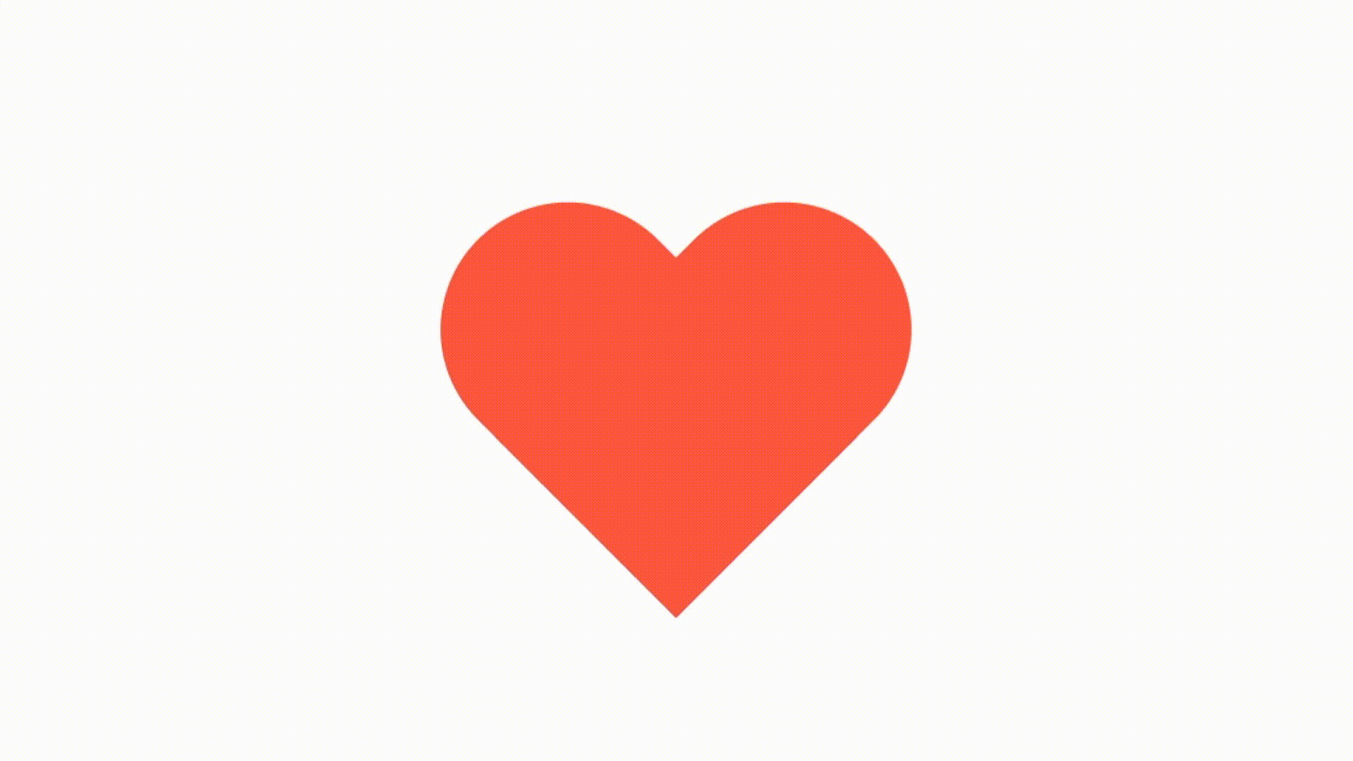
The Heart ❤️#
Event tho a heart looks like a complicated shape, because of all its curves, it is really no that heart(ha, got it?) to create it in CSS.
We are basically adding two boxes with curved corners and transforming them into each other:

.heart {position: relative;width: 200px;height: 160px;}.heart:before,.heart:after {position: absolute;content: "";width: 100px;height: 160px;left: 100px;background-color: tomato;border-radius: 100px 100px 0 0;transform: rotate(-45deg);transform-origin: 0 100%;}
Since he have created two pseudo elements, we can flip the other one on the Y axis to get the final shape:

.heart {position: relative;width: 200px;height: 160px;}.heart:before,.heart:after {position: absolute;content: "";width: 100px;height: 160px;left: 100px;background-color: tomato;border-radius: 100px 100px 0 0;transform: rotate(-45deg);transform-origin: 0 100%;}.heart:after {left: 0;transform-origin: 100% 100%;transform: rotate(45deg);}
Important to note is that the origin of transformation (or rotation in this case) has been changed by setting transform-origin to the bottom right corner or 100% 100%, which is indicated by the black dot in the picture above.
And this is how you create a heart in css, it wasn’t that complicated, right? 😃
The Diamond 💎#
Like the heart, the diamond isn’t really complicated. I encourage you to take yourself 10 minutes and try to create the diamond on your own.
Let’s start by creating a stretched out variant of our 4 triangles from earlier:

.diamond {width: 200px;height: 0;border-top: 100px solid lightgreen;border-right: 100px solid mediumpurple;border-bottom: 100px solid hotpink;border-left: 100px solid moccasin;}
If you look closely you can already see the top part of the diamond at the bottom of the image.
Now, let’s change the colours, adjust some border widths and remove the top border, since we have no use for it anymore.
You should end up with a shape like this:

.diamond {position: relative;width: 200px;height: 0;/* border-top: 100px solid lightgreen; */border-right: 100px solid transparent;border-bottom: 80px solid hotpink;border-left: 100px solid transparent;}
Finally, we add a pseudo element, :after in this case and apply the same techniques as when we created the single triangle:

.diamond {position: relative;width: 200px;height: 0;border-right: 100px solid transparent;border-bottom: 80px solid hotpink;border-left: 100px solid transparent;}.diamond:after {content: "";position: absolute;border-top: 300px solid hotpink;border-right: 200px solid transparent;border-left: 200px solid transparent;transform: translateX(-100px) translateY(80px);}
Not that the position property on the pseudo element is set to absolute to position the bottom part better under the top part of the diamond.
Now you can ice out your projects with ease! 🤑💎
The Magnifying Glass 🔍#
Did you ever wanted to create a magnifying glass icon in CSS by yourself, instead of using a boring svg?
Yeah, probably not… But let’s create one anyway!
First, create a circle with a coloured border:

.magnifying-glass {position: relative;width: 100px;height: 100px;box-sizing: border-box;background-color: aliceblue;border: 15px solid slategray;border-radius: 50%;}
And that’s how fast we’re halfway through. The only thing left todo is to create and position the handle of the magnifying glass.

.magnifying-glass {position: relative;width: 100px;height: 100px;box-sizing: border-box;background-color: aliceblue;border: 15px solid slategray;border-radius: 50%;}.magnifying-glass:after {content: "";position: absolute;bottom: 0;right: 0;width: 50px;height: 15px;background-color: slategray;border-radius: 0 7.5px 7.5px 0;transform-origin: 0 50%;transform: translateX(100%) rotate(45deg);}
Et voilà, and it can be that easy to create a magnifying glass in CSS.
But why shouldn’t I just use SVGs?#
Of course you have to spend more time creating shapes like this in CSS instead of using a SVG or an icon font, but since these shapes are purely CSS it is incredibly easy to make them interactive, like adding an hover effect:
 I recommend you to add a wrapper around the shape you want to style to preserve the transformations on the shape itself.
<div class="heart-wrapper"><div class="heart"></div></div>
Let’s add a scale transform for example:
.heart {position: relative;width: 200px;height: 160px;}.heart:before,.heart:after {position: absolute;content: "";width: 100px;height: 160px;left: 100px;background-color: tomato;border-radius: 100px 100px 0 0;transform: rotate(-45deg);transform-origin: 0 100%;}.heart:after {left: 0;transform-origin: 100% 100%;transform: rotate(45deg);}.heart-wrapper {cursor: pointer;width: 200px;height: 160px;transition: transform 0.3s cubic-bezier(.25, .8, .25, 1);}.heart-wrapper:hover {transform-origin: 50% 50%;transform: scale(1.3);}
Now it’s your turn, try and recreate some shapes or icons you like in CSS, remember: The only limitation is yourself!
I hope I could show you some neat tricks with this little tutorial.
Cheers, Max.